OBJECTIVE
Create a timeline in an effective manner to show the progress of an item over a time span with an existing client. I picked the Museum of Ice Cream which is an art installation and museum with locations across the United States.
COLOR PALETTE

TYPE CHOICES
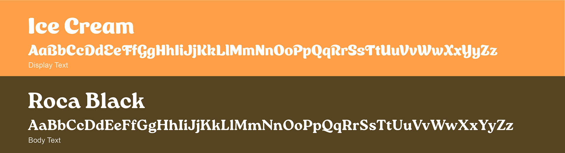
Ice Cream (display text)
I chose the Ice Cream typeface for its playful, rounded style that resembles the soft, swirly texture of real ice cream. It adds a fun, cheerful tone and works perfectly for titles and headings to grab attention.
I chose the Ice Cream typeface for its playful, rounded style that resembles the soft, swirly texture of real ice cream. It adds a fun, cheerful tone and works perfectly for titles and headings to grab attention.
Roca Black (body text)
Roca Black provides boldness and balance. Its clean yet friendly shape makes the content easy to read while still feeling warm and approachable, ideal for body text and subheadings.
Roca Black provides boldness and balance. Its clean yet friendly shape makes the content easy to read while still feeling warm and approachable, ideal for body text and subheadings.
RESEARCH FINDINGS
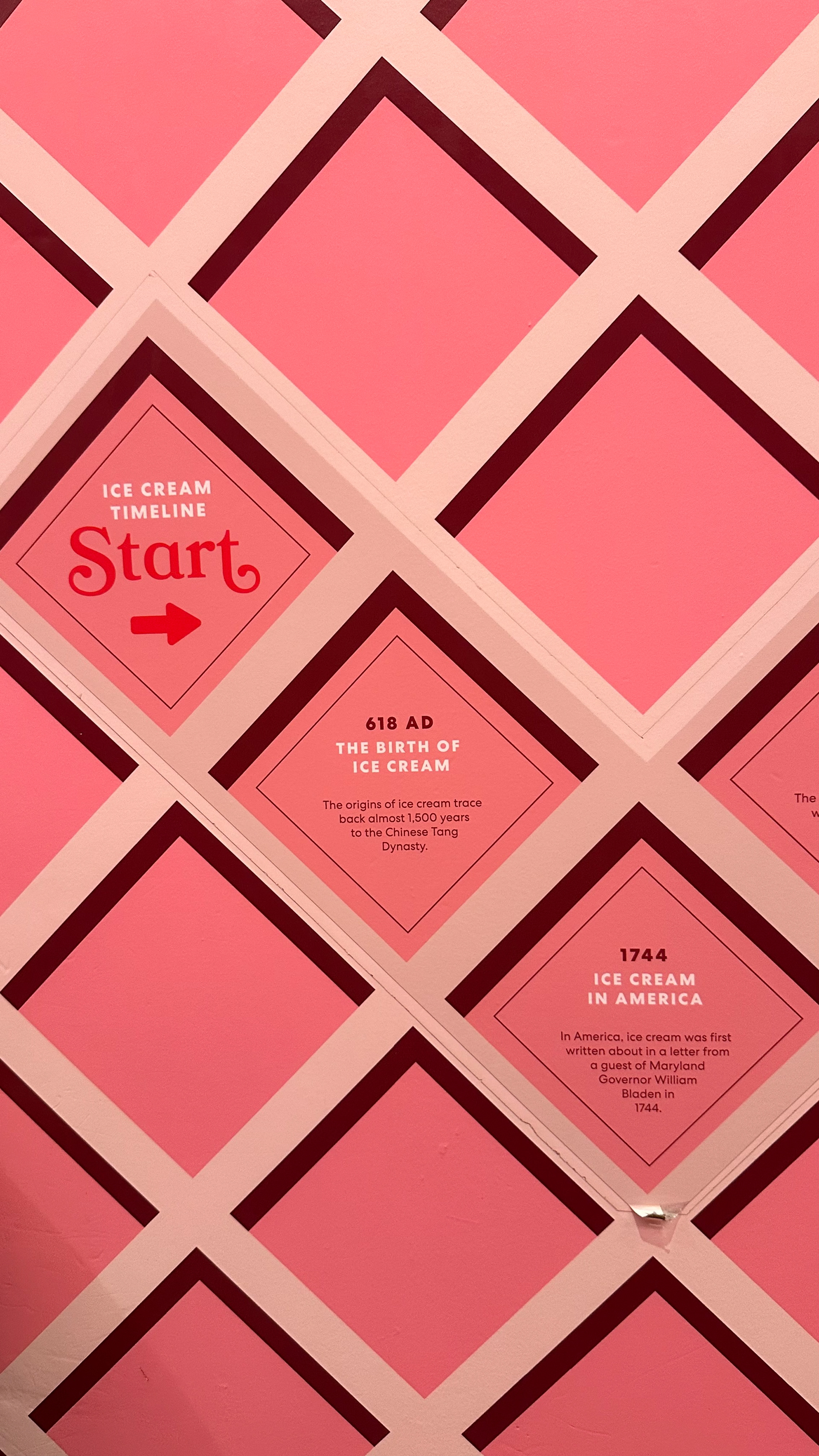
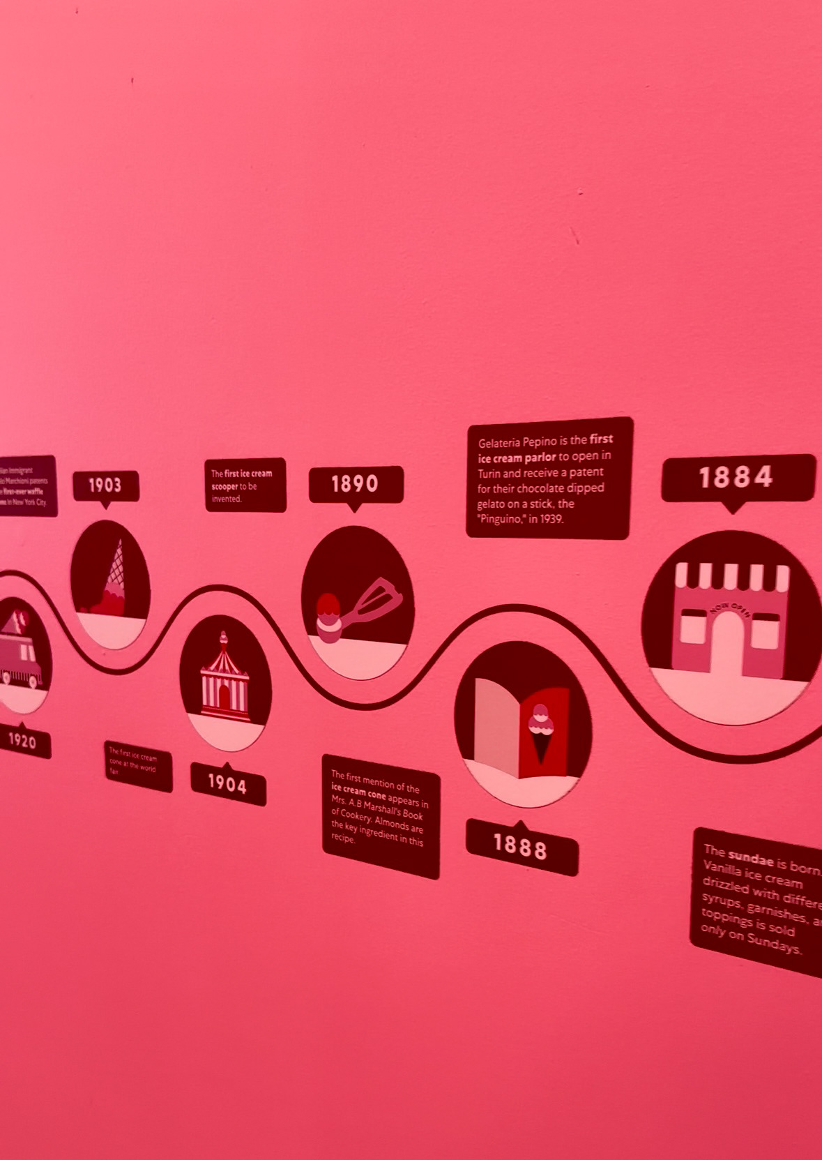
The MOIC uses a waffle cone to represent the timeline and facts about ice cream at the entrance of the store. There were some problems that I wanted to fix to make the timeline more personalised and visually engaging.
Clarity: The museum timeline has small text and a bright background, making it hard to read.
Visual Appeal: While the timeline features some illustrations, it might just be too repetitive with the same style and just text at some places with no use of infographics to convey information.
Color scheme: The colors don’t have a lot of contrast which would help drive attention and make it more appealing to the audience.
SOLUTION
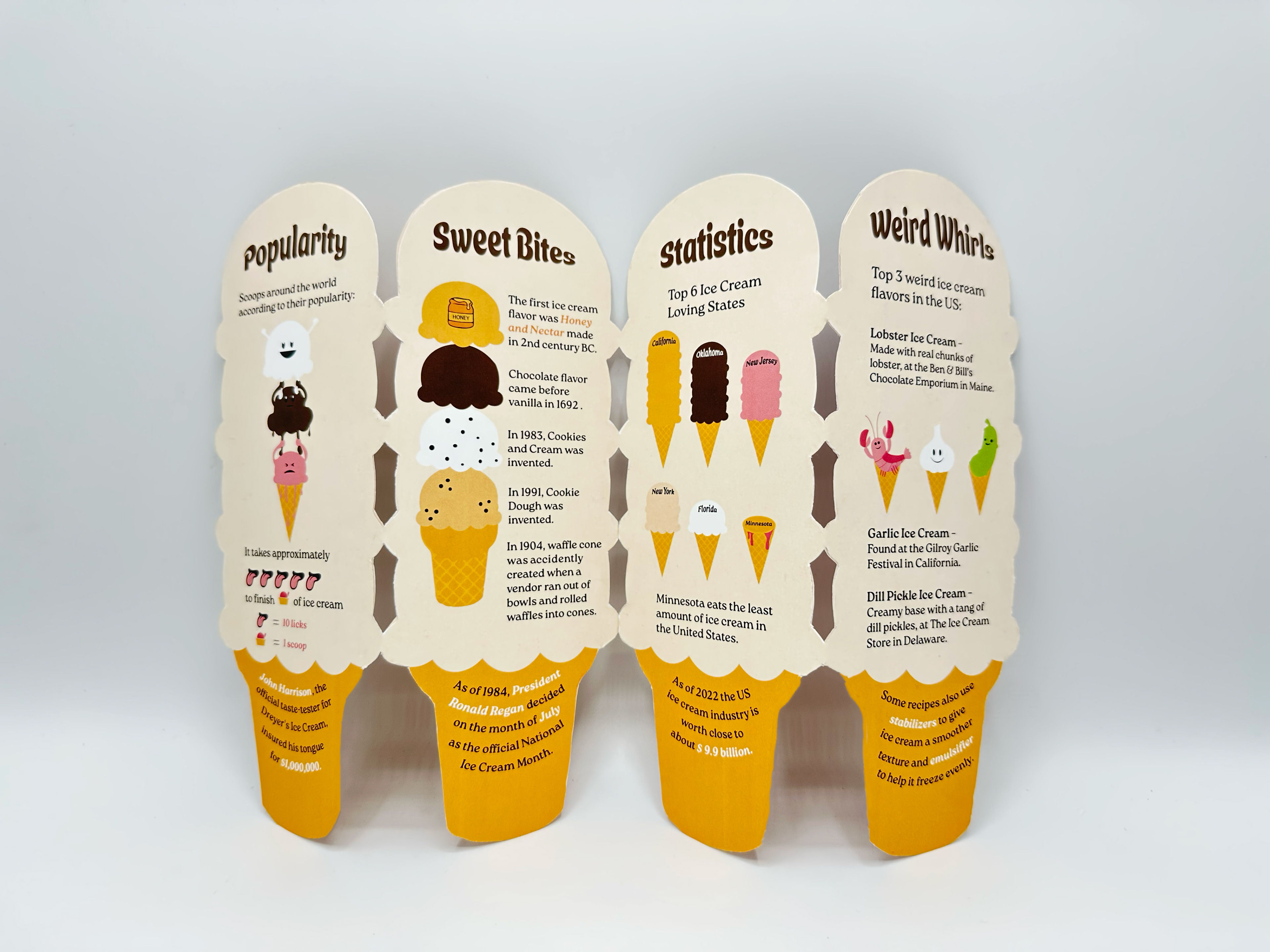
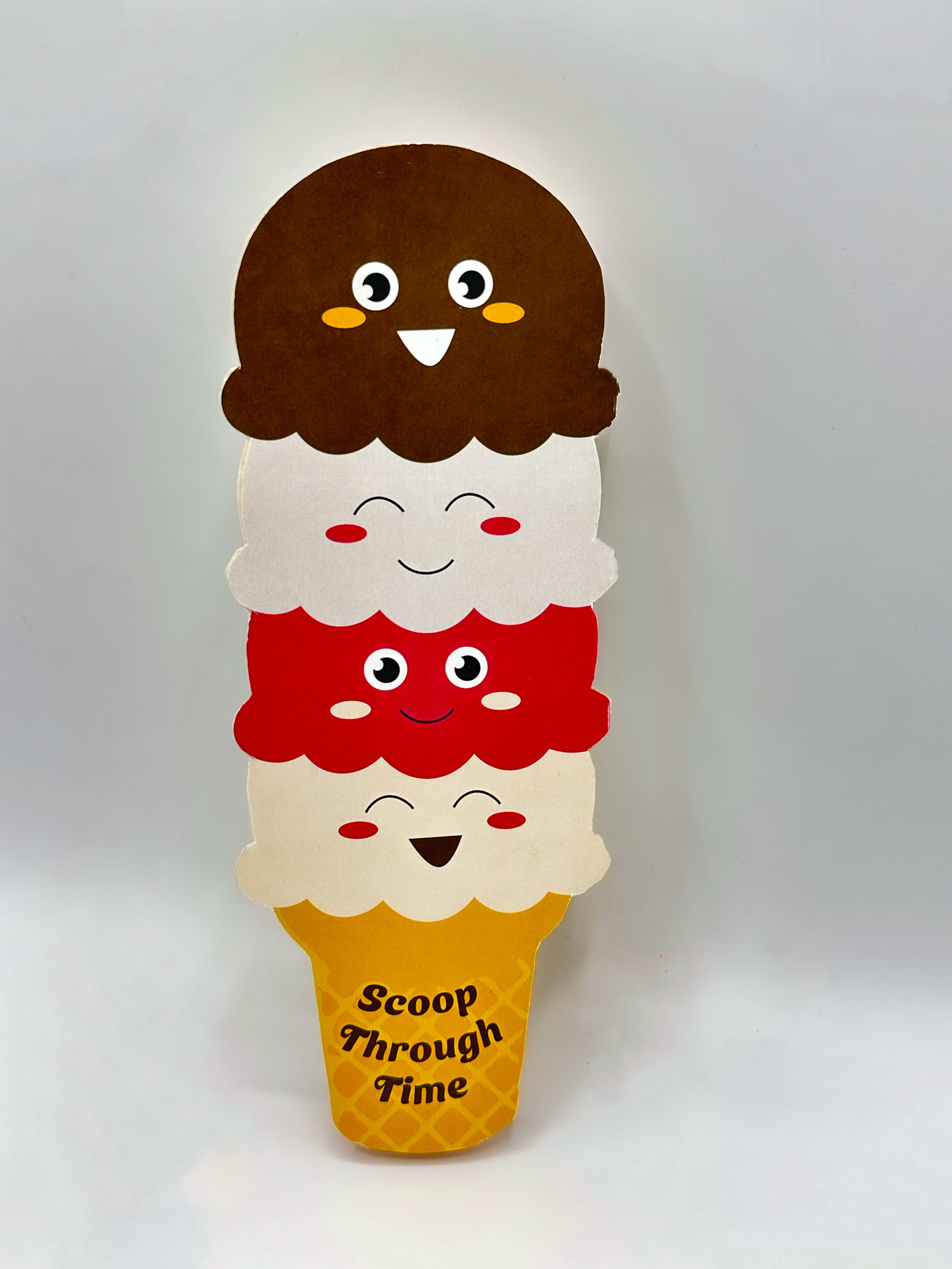
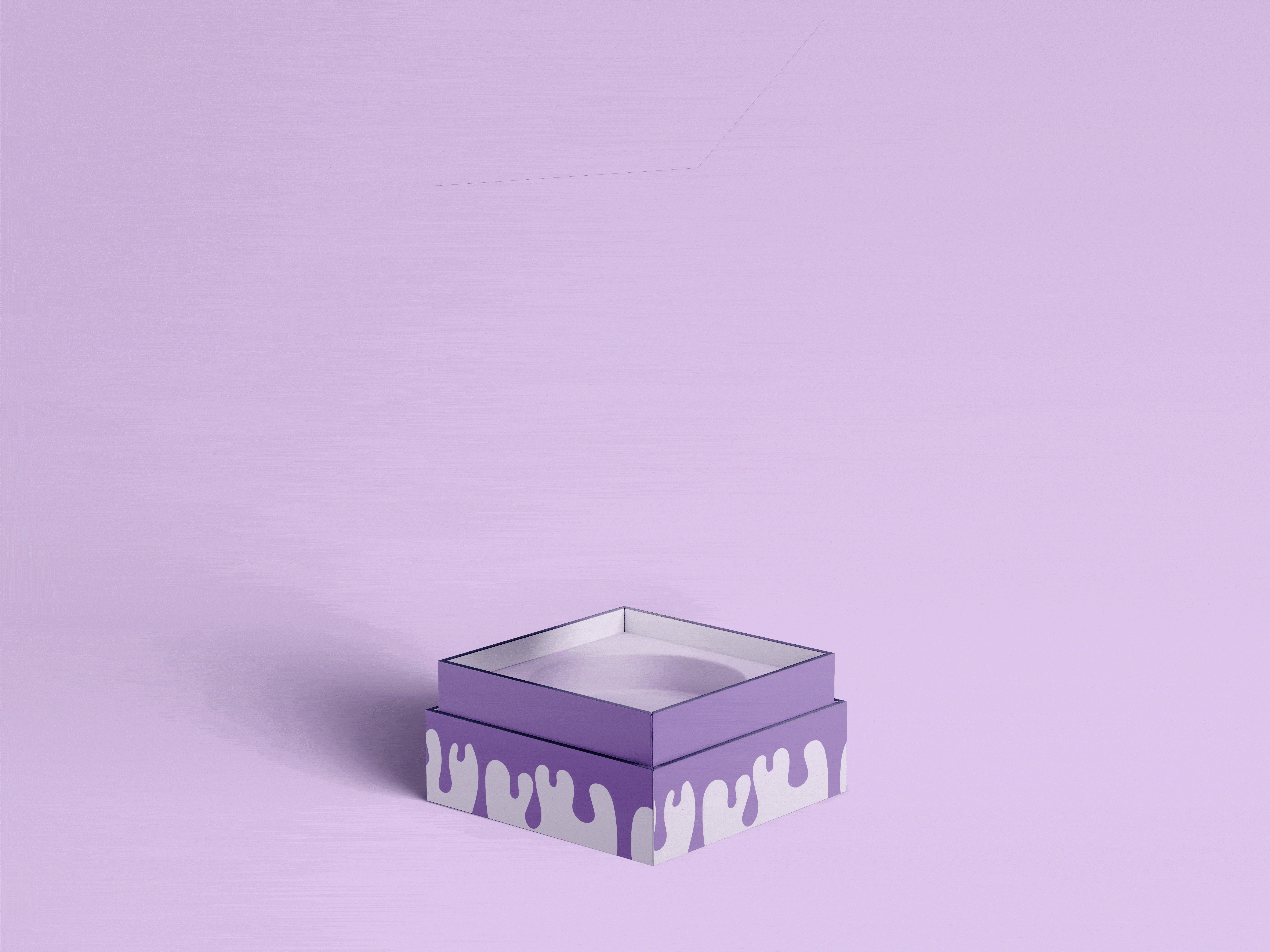
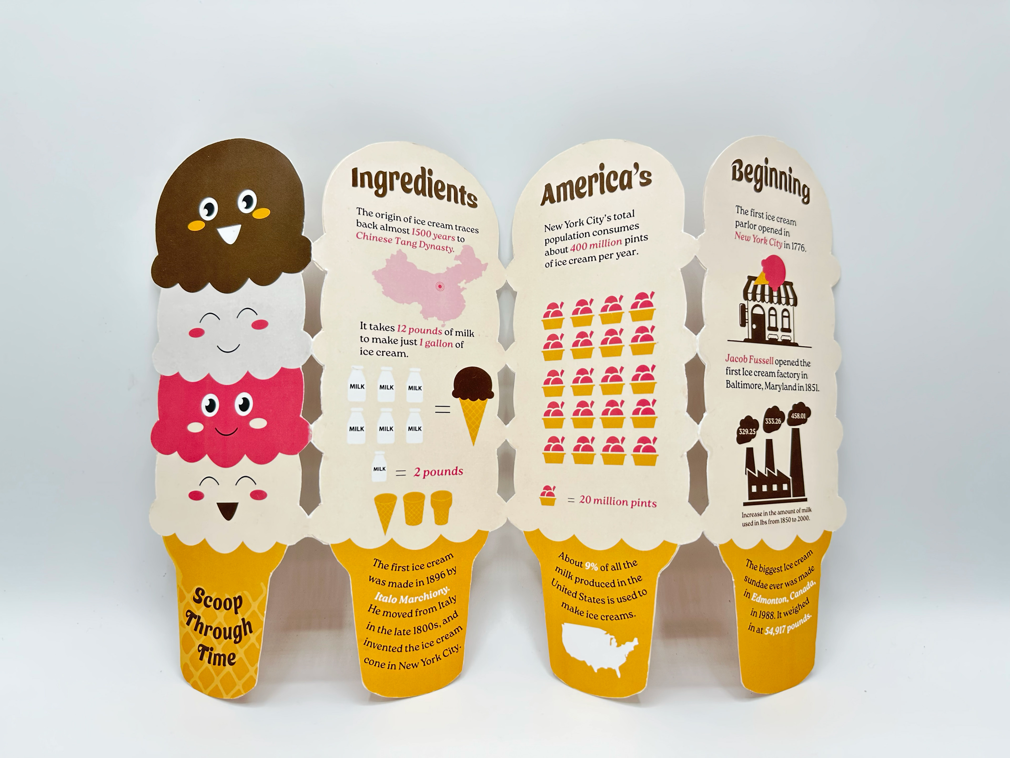
These accordion booklets were designed as engaging handouts for guests waiting in line at the Museum of Ice Cream, offering a deeper dive into the world of ice cream. While creating a fun, hands-on, and interactive experience, the booklet provides bite-sized facts, quirky trivia, and sweet visuals to entertain and educate visitors before they enter the main event.
FINAL DELIVERABLE